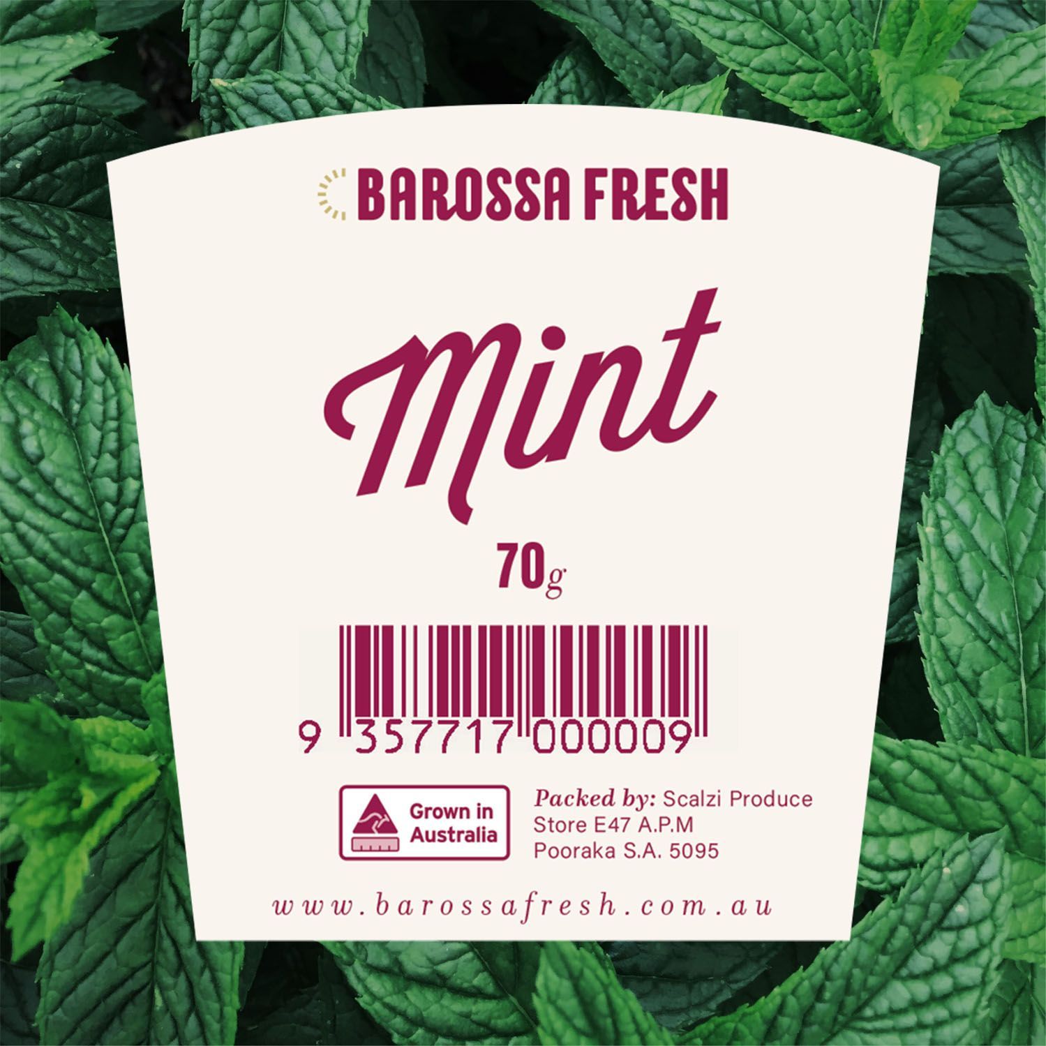
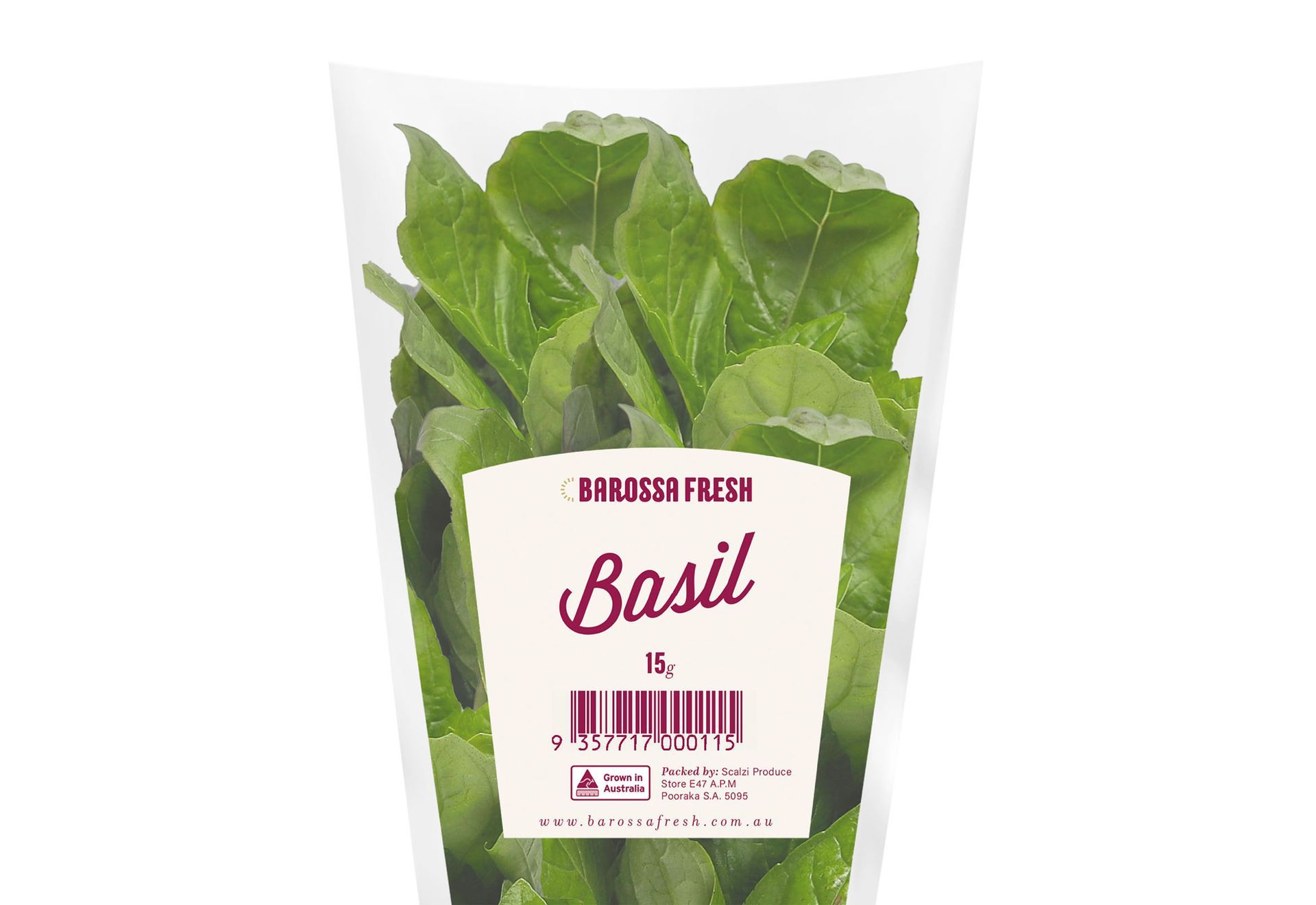
Building on the key colours and fonts from the brand identity we had recently developed for Barossa Fresh, we created a distinctive sub-brand that worked seamlessly across various label shapes and sizes, including bottles and other packaging formats.
Barossa Fresh packaging
Branding
Art direction
Design systems
Logo design
Packaging design
about this project
We approached the packaging design for Barossa Fresh with a focus on clarity, regional authenticity, and strong shelf appeal.
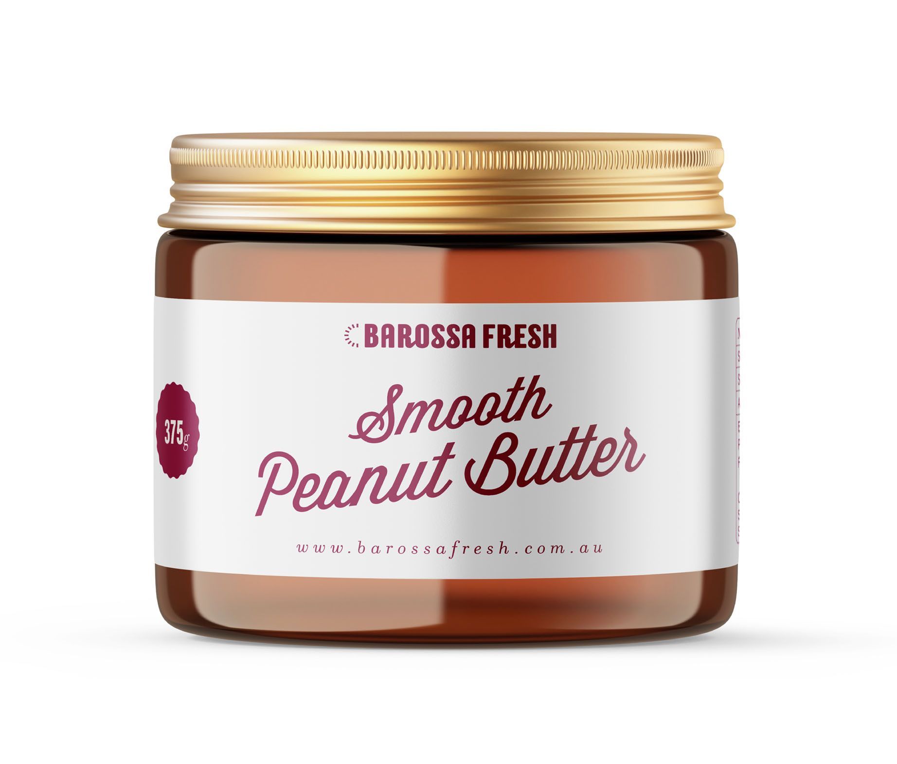
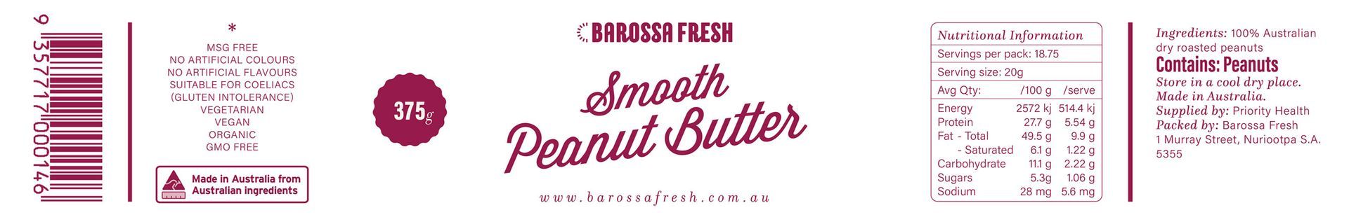

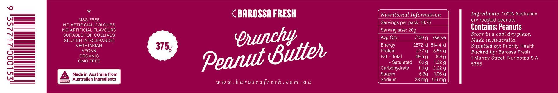

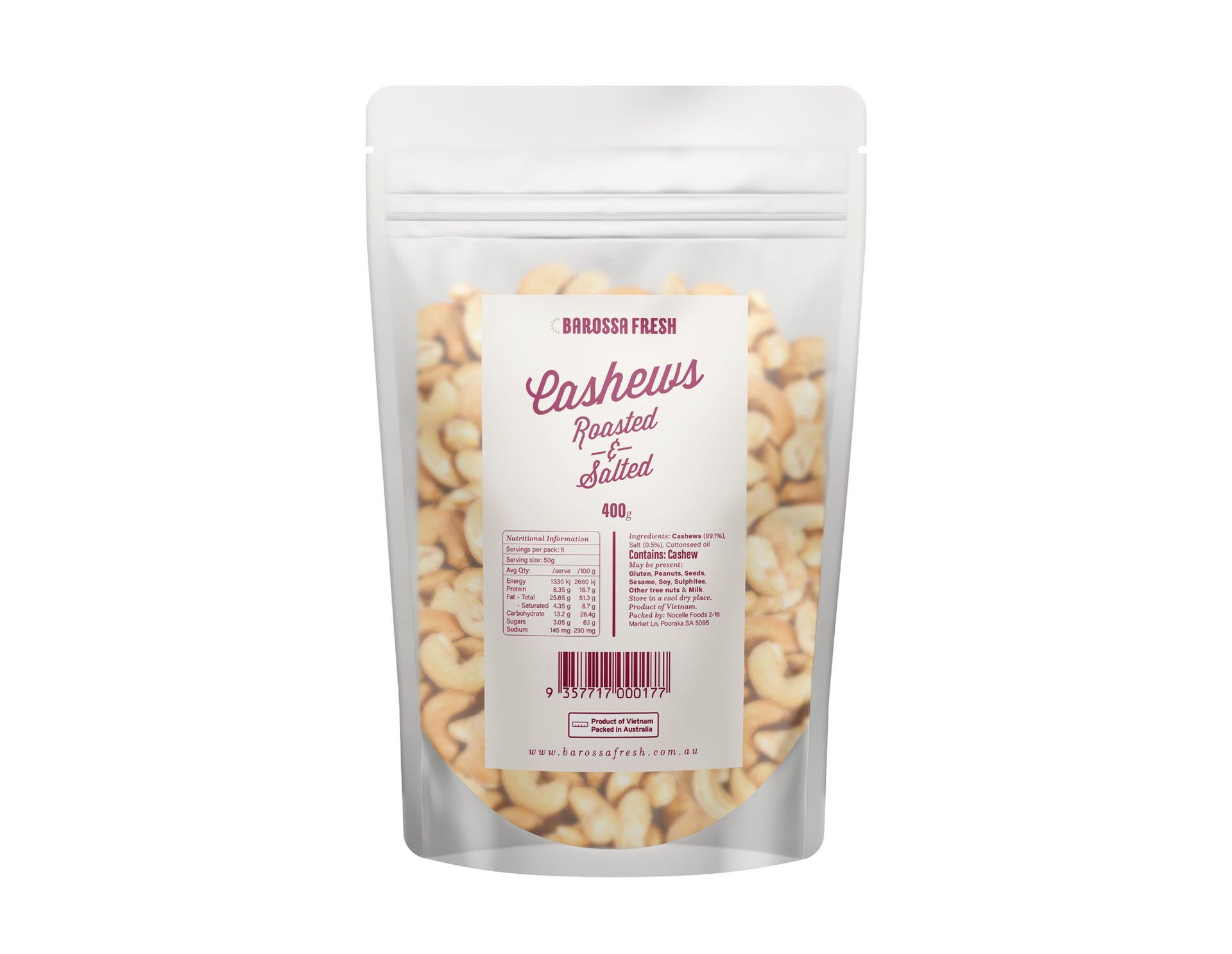
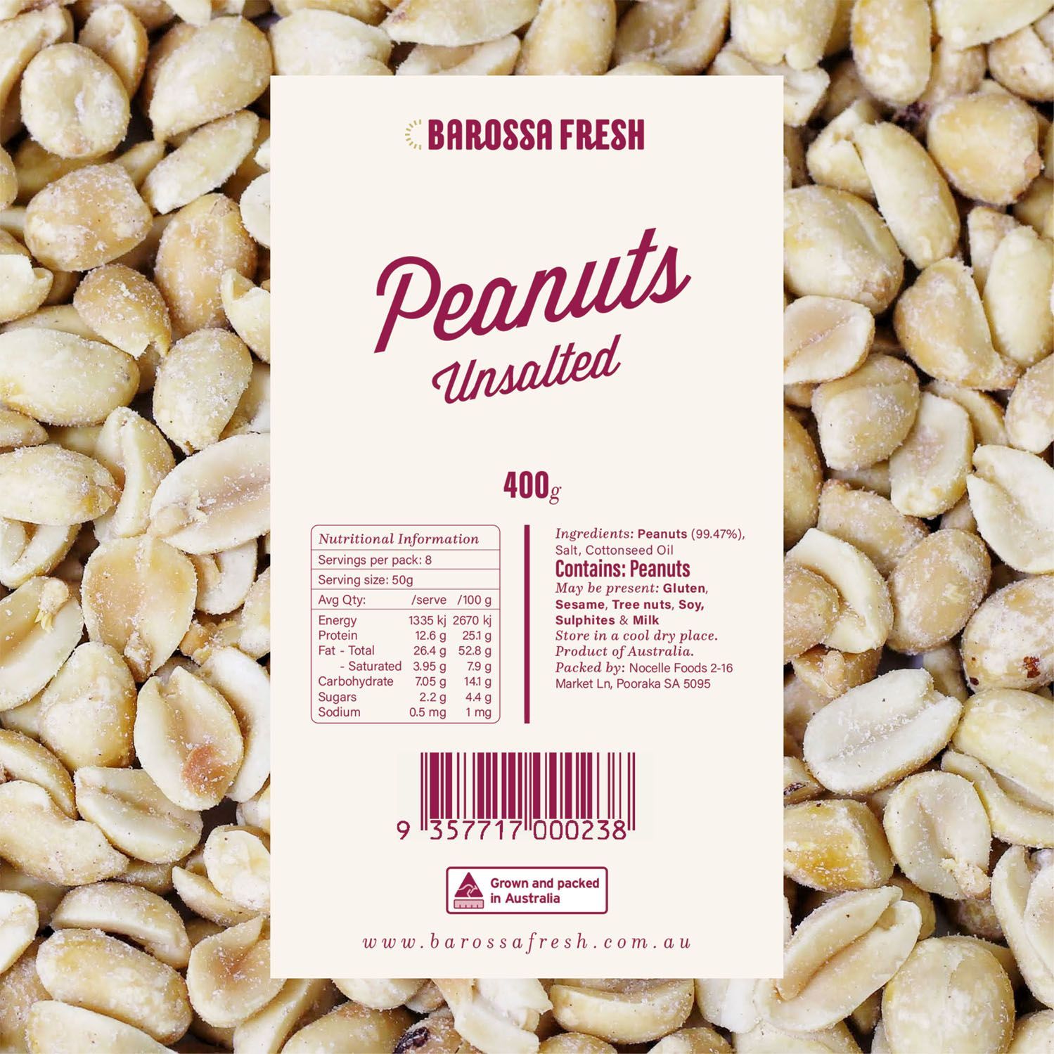
The result was a cohesive suite of packaging that not only stood out visually but also reinforced Barossa Fresh’s reputation for integrity and excellence.