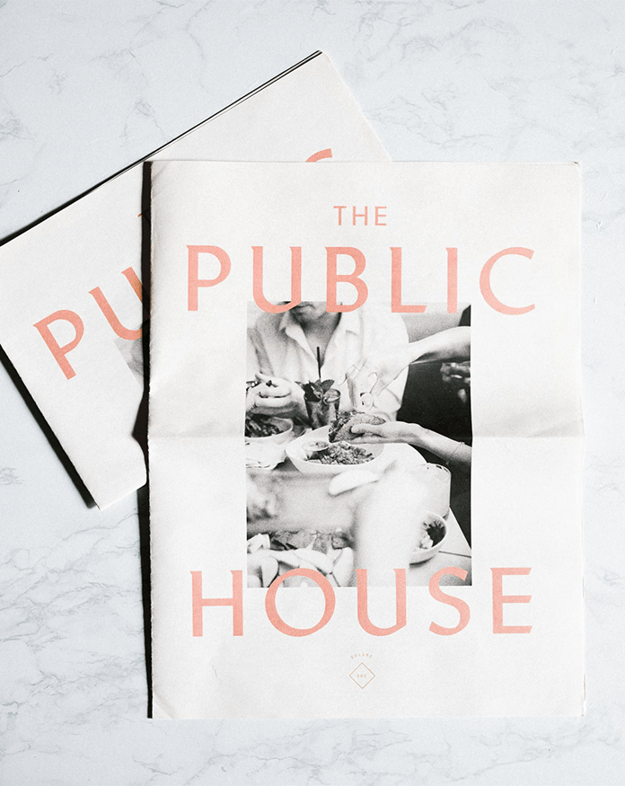
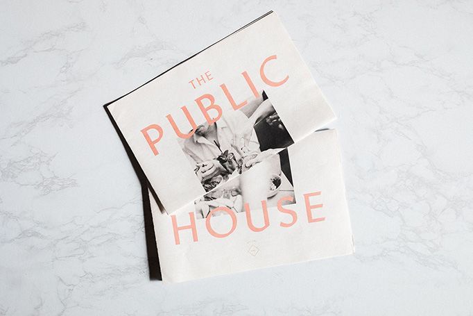
Paper perfection: the artful menu of The Public House, Bay City, Michigan
The Public House menu design immediately captivated me with its distinct style. The choice of journal paper as the base is brilliant and evokes a sense of nostalgia and familiarity. This isn’t just a menu; it feels reminiscent of a well-loved newspaper or magazine.
Colour Psychology in Restaurant Menu Design
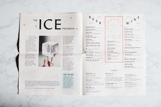
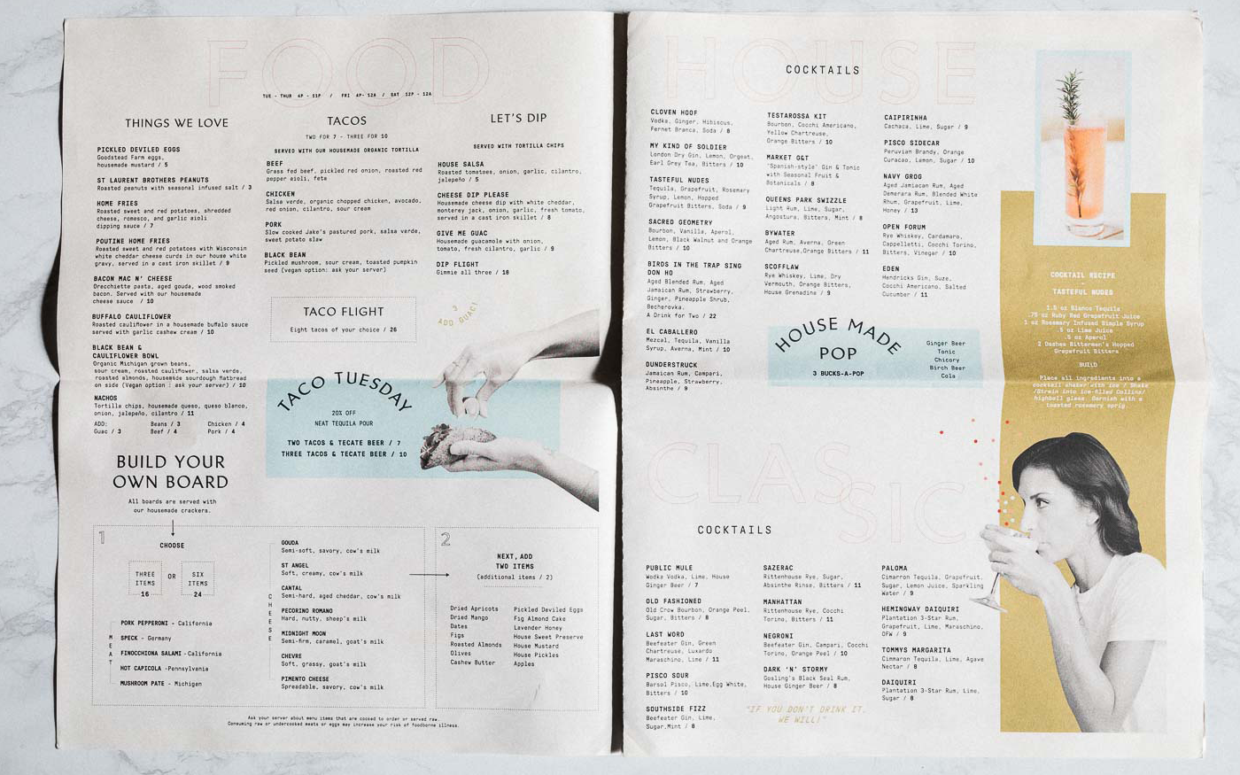
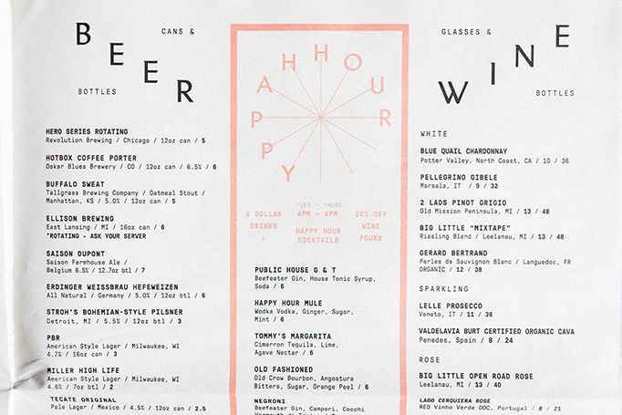
The Public House menu’s colour palette is harmonious, with a predominant use of soft pastels. The subtle hues of pink and blue are soothing to the eyes, inviting you to linger over the offerings, while the occasional burst of brighter colours, like the yellow used in the Cocktails section, draws attention to key areas.
One particularly captivating feature is the Happy Hour section, cleverly designed to resemble a clock. This playful design choice not only adds a fun touch, it also subtly hints at the timing of the happy hour.
Black and White Photography
The use of candid black-and-white photos adds a layer of timelessness to the menu and contrasts beautifully with the soft colours. For me, as a menu designer, they reinforce the theme of nostalgia while providing a visual break that enhances the overall aesthetic.
For anyone interested in graphic design, restaurant and bar menu design in particular, this menu is a perfect example of how thoughtful design can elevate an everyday object into something truly special.
Categories