The Meira menu design: a nostalgic culinary journey
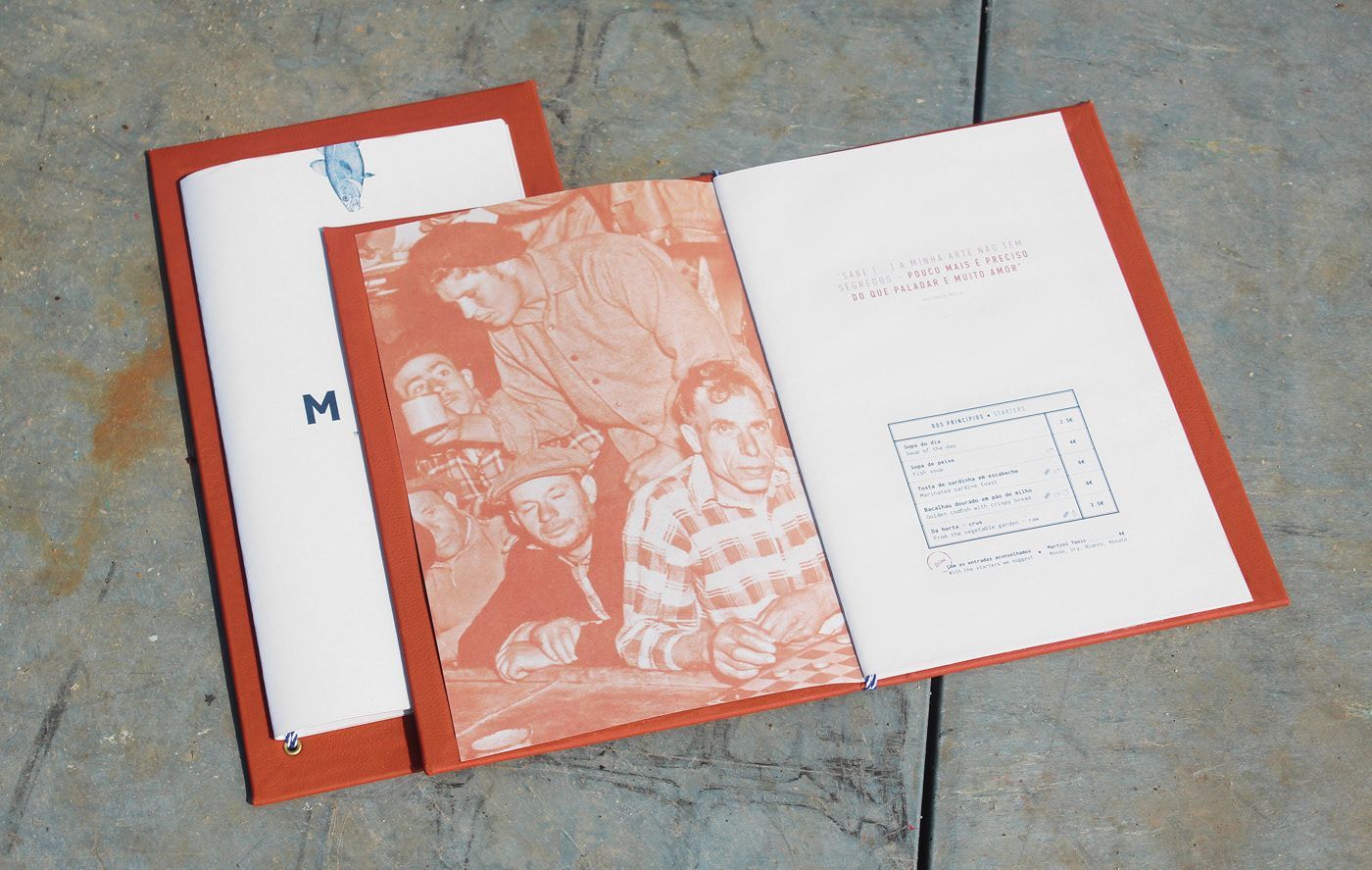
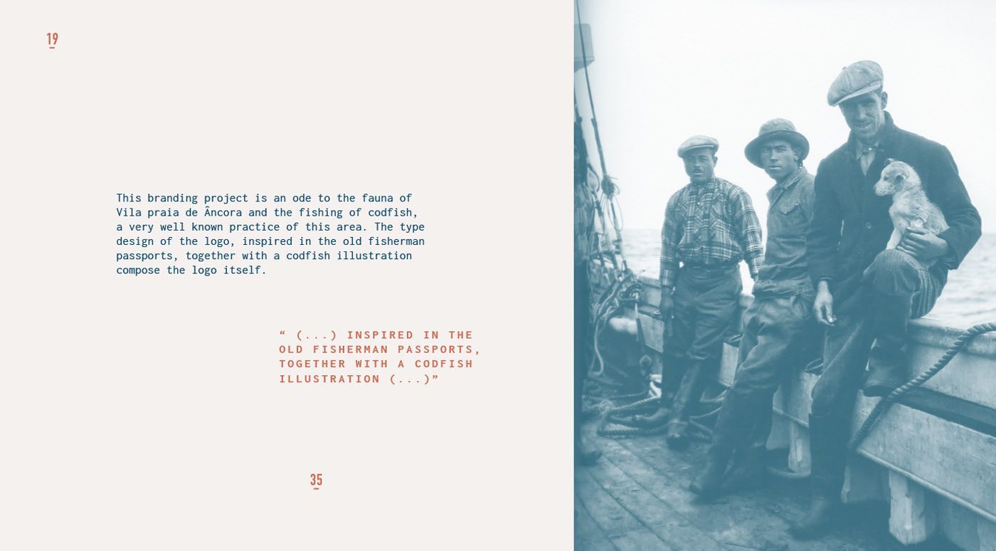
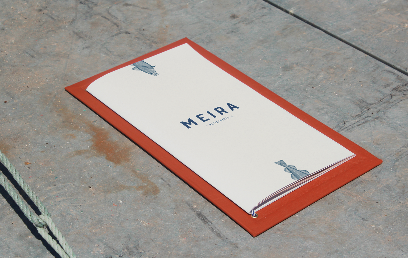
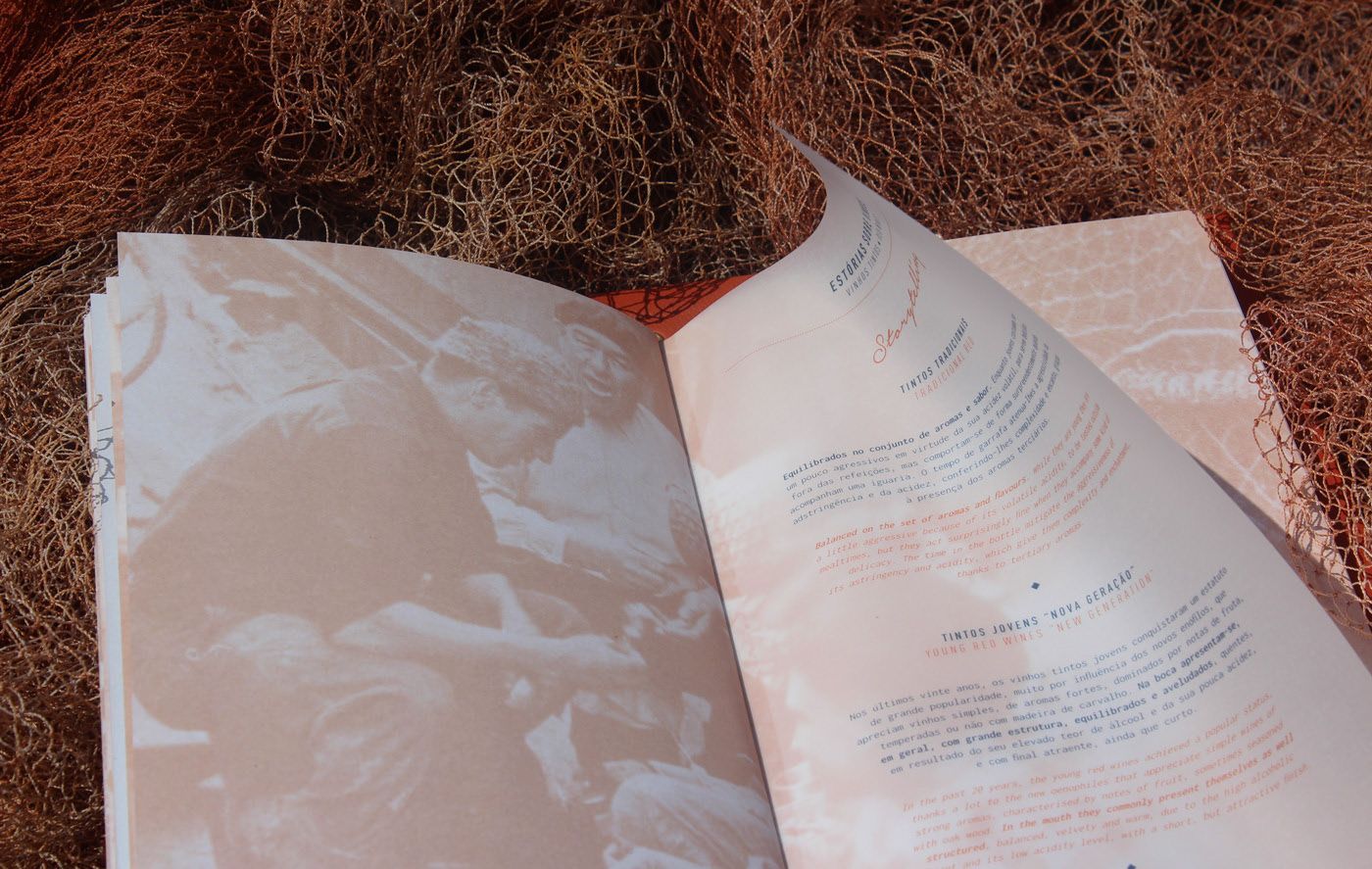
The Meira menu is more than just a list of dishes; it’s a journey into the world of culinary tradition. Surrounded by a rich orange cover, the menu’s design immediately evokes a sense of warmth and authenticity. Inside, photographs of dining scenes and artisanal food preparation set a nostalgic tone, inviting us to savour both the history and flavours of Meira’s offerings.
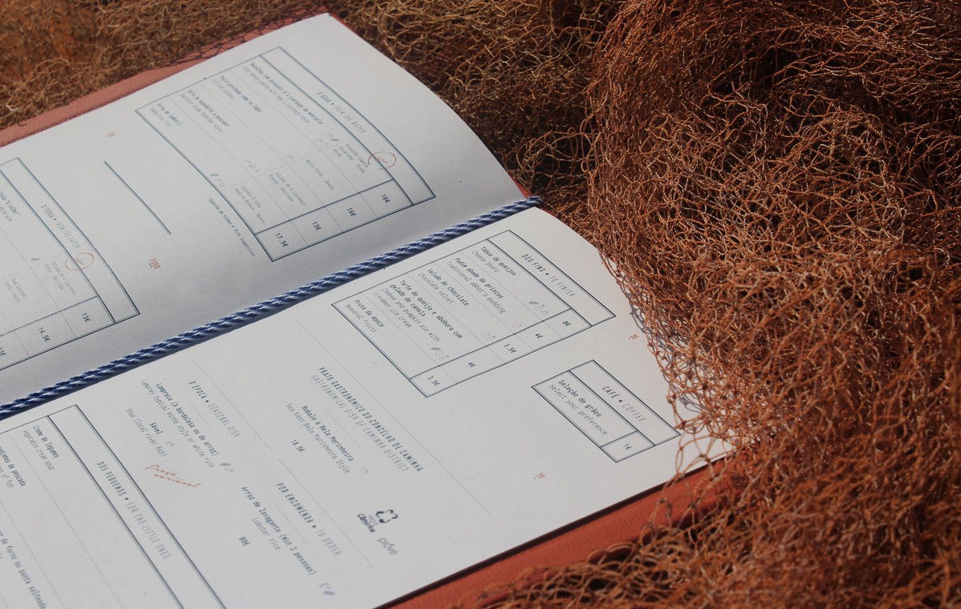
Visual Design and Brand Identity
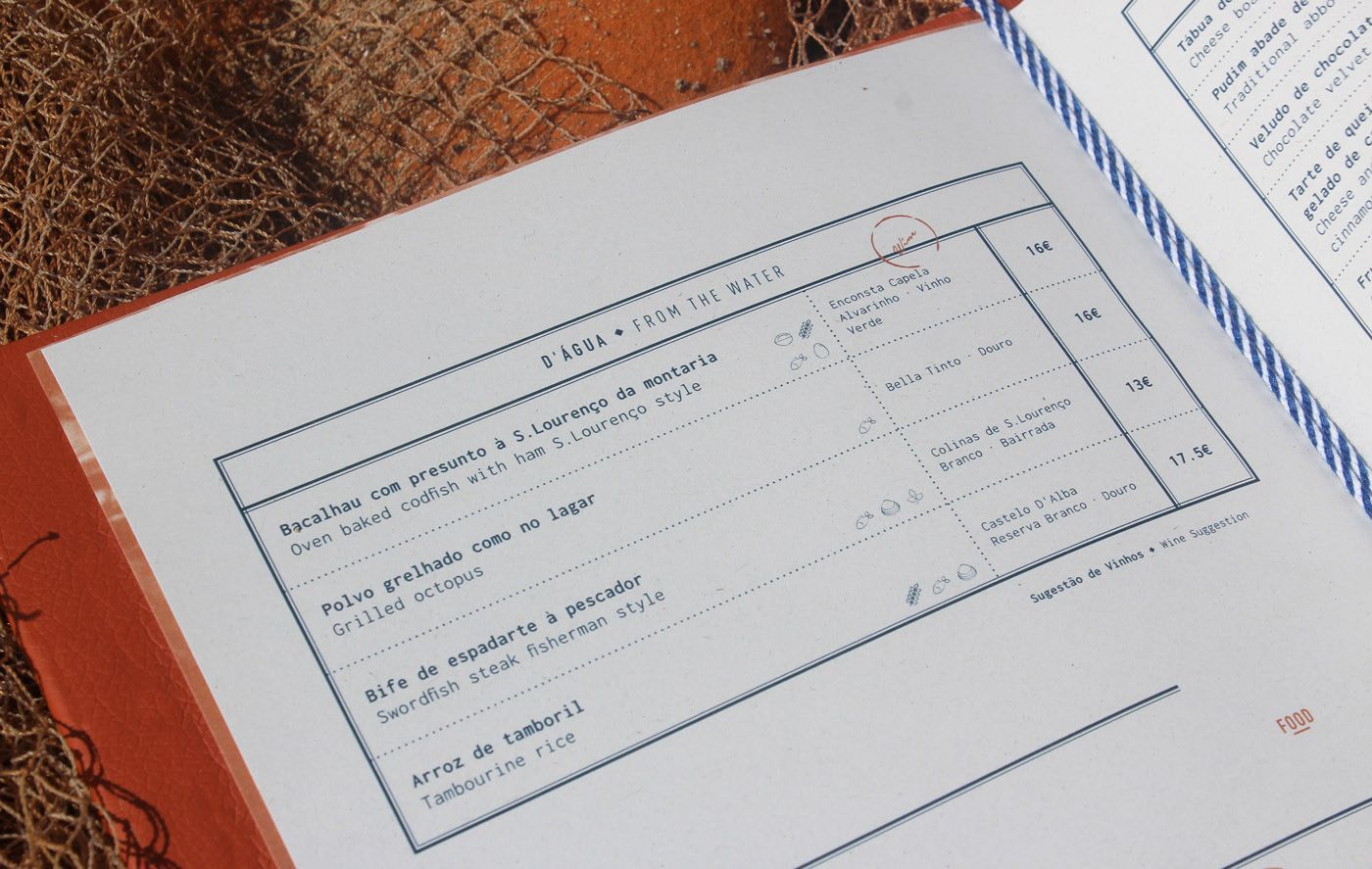
The menu’s layout is both functional and visually appealing. Clean lines and clearly defined sections guide the eye across the pages. The use of blue ink for the text contrasts beautifully with the white pages, ensuring readability while adding a touch of sophistication. Each dish is presented with clarity, accompanied by concise descriptions that highlight key ingredients and cooking methods.
See it on www.327.pt/restaurante_meira/
Menu Layout and Typography
The minimalist typography adds elegance, making the Meira menu a true testament to culinary tradition and design. The combination of sans-serif and serif fonts create a harmonious balance between modernity and tradition, reflecting the restaurant’s commitment to both innovation and heritage.
Why the Meira Menu Stands Out
Overall, it is a perfect blend of tradition and sophistication. The menu not only offers a variety of delicious dishes, it also tells a story of heritage and craftsmanship. Each page invites diners to savour the rich history and flavours that make Meira a unique and memorable dining destination.
See it on
www.327.pt/restaurante_meira/
Categories