Eugene's Canteen Menu Design: A Bold, Playful Approach to Restaurant Branding
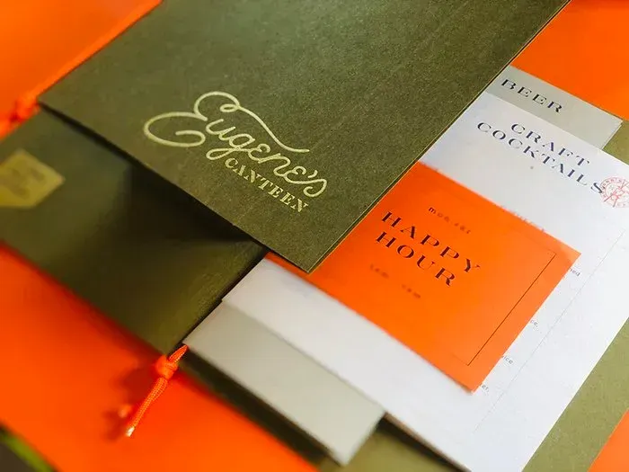
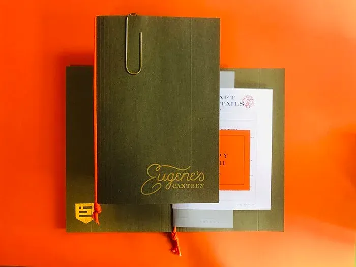
The menu design for Eugene’s Canteen grabbed my attention immediately with its use of bold colours. The olive green cover paired with a bright orange interior is eye-catching, and the paper clip detail makes it feel like you are opening a notebook rather than a bar menu.
Award-Winning Design by Piink Iink
This playful menu design comes from Jenny Boehme, an award-winning designer and illustrator at Ohio-based Piink Iink. It demonstrates how thoughtful typography and layout choices can elevate restaurant branding.
Typography and Visual Hierarchy
Inside the menu, clean white pages feature well-spaced typography that ensures easy readability while maintaining visual appeal. The combination of bold header fonts and lighter body text creates clear visual hierarchy, guiding guests through drink options without overwhelming the page.
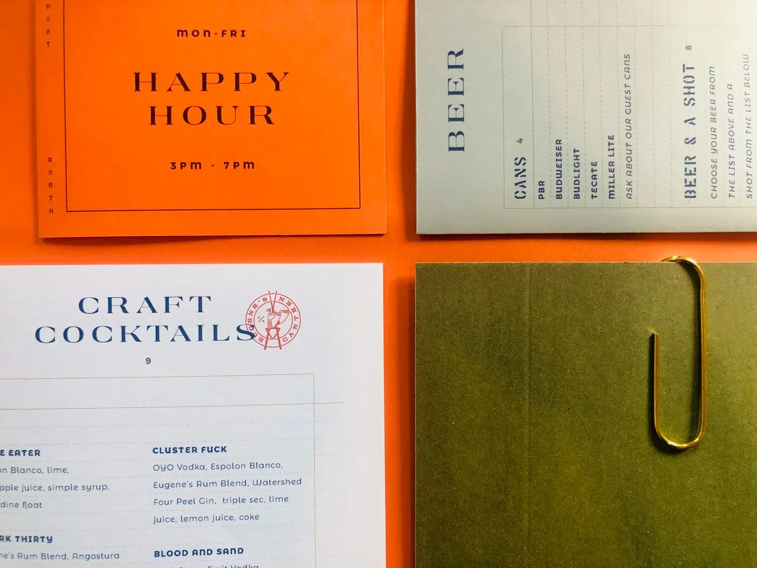
Interactive Orange Inserts Add Visual Interest
The orange insert pages for the Happy Hour and Craft Cocktails sections serve as delightful surprises throughout the menu. These colour-blocked additions create movement and give each section its own distinctive moment, making the dining experience feel more interactive and engaging.
Colour Psychology in Menu Design
The balance between olive green and bright orange accents keeps the design feeling fresh and modern while maintaining a warm, welcoming atmosphere.
Key Takeaways for Restaurant Menu Design
The Eugene’s Canteen menu proves that thoughtful design elements – including colour selection, typography choices and material quality – can transform a simple drinks list into a memorable brand touchpoint. It’s an excellent example of how menu design contributes to overall customer experience and restaurant identity.
Categories