Paris 2024: Redefining Olympic Pictograms
The Olympic Games represent excellence, achievement, and global unity, with each edition’s design elements playing a crucial role in expressing its unique identity. The 2024 Paris Olympics pictograms exemplify this tradition, blending innovation, heritage, and accessibility through thoughtful visual design.
Bold Geometric Design and Visual Identity
They are characterised by their bold geometric shapes and lines, creating a modern and cohesive look across different sports. The pictograms’ design not only ties the pictograms together but also reenforces their recognisability, making them readily identifiable. Despite the complexity of their geometric forms, the pictograms are designed to be easily understood by a wide audience, guiding them at competition venues and enhancing the overall experience of the Games.
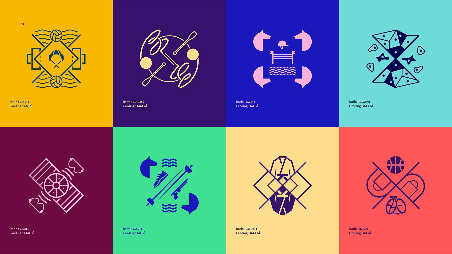
Vibrant Colour Palette and Visual Impact
The colour palette is vibrant and sophisticated, balancing bright and muted tones to create a visual contrast. These colours capture the festive and diverse atmosphere of the Olympics, making the pictograms pop without being too overwhelming. The design approach honours classic Olympic visual traditions while pushing boundaries with modern aesthetics.
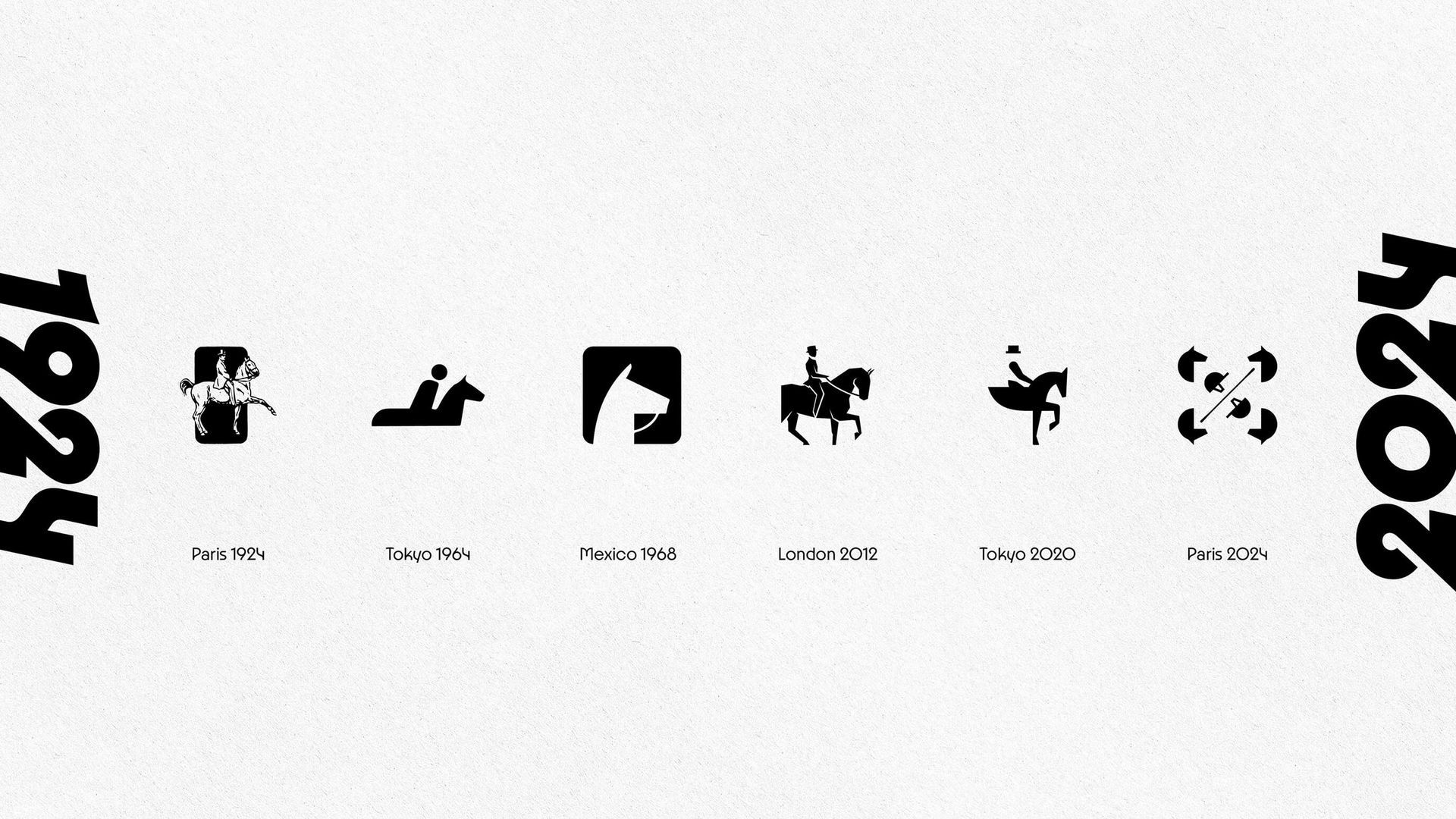
Modern Evolution of Olympic Design Language
The evolution of Olympic pictograms highlights a clear trend towards simplification and modernity. From detailed designs in the past to the more streamlined modern designs of recent editions, the focus has shifted to creating symbols that are both aesthetically pleasing and functionally versatile, balancing classic symbolism with modern design principles.


Categories